
Paceline
Your Pace. Your Potential.
A high-energy brand film that establishes the motion identity for a health & wellness platform .. From kinetic language, to logo sting.
Brief
To define the motion identity for Paceline's brand film - building a sophisticated visual language from a set of loose brand guidelines, and extending that system through to a 'Netflix-style' brand sting.
Strategy
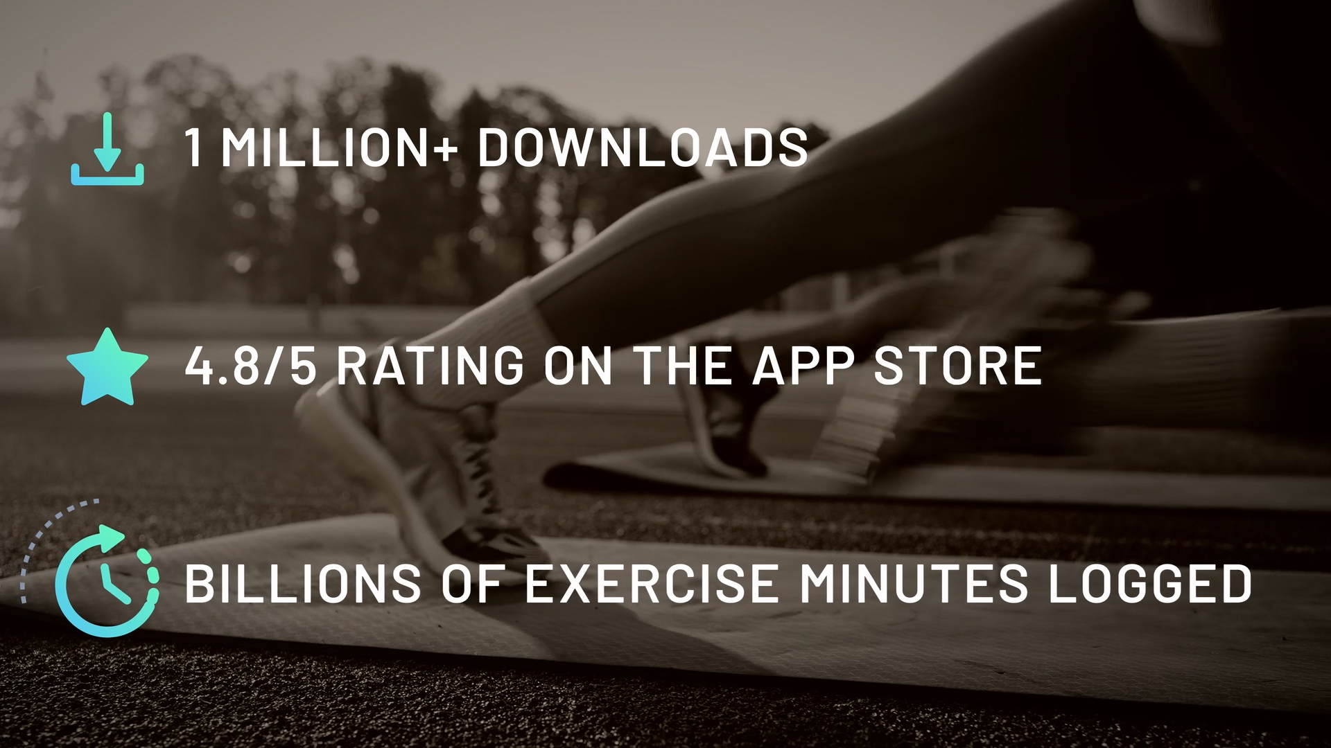
The starting point was the app's own UI .. Its vibrant colours, and clean iconography - used as raw material for a kinetic language that didn't initially exist. Rather than animating brand assets, the goal was to build a motion system that felt like a natural, motivating extension of the product - something a user would recognise before they'd consciously registered exactly why.
Key Techniques
Motion identity & system development
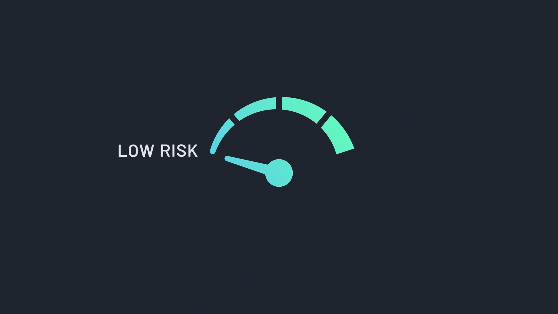
Kinetic typography & iconography
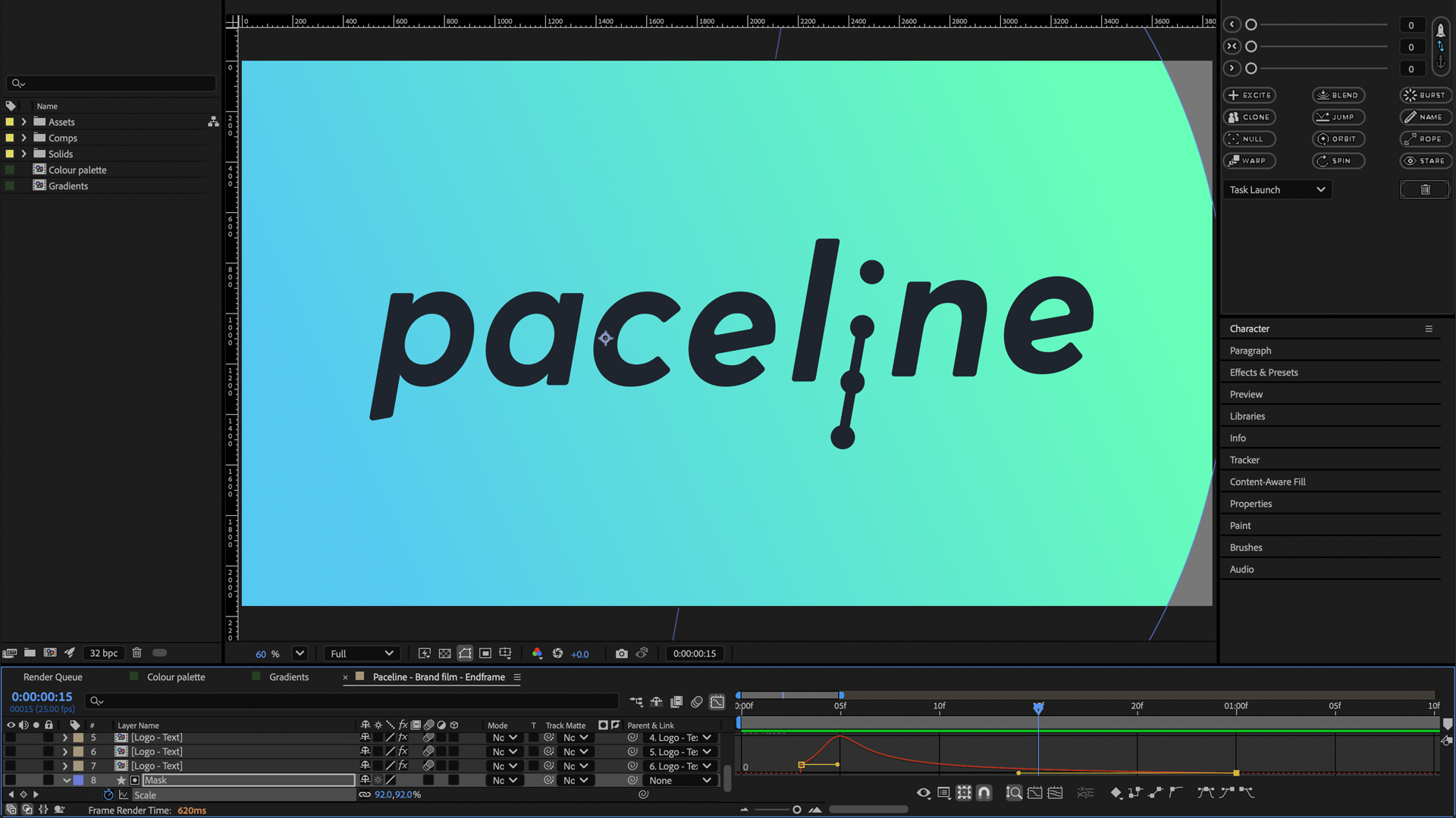
Brand reveal & logo animation
Result
The client's reaction captured the project's high-energy finish, declaring:
'BOOM! I think we’ve nailed it. Thanks so much for putting up with me through this. I think it’s outstanding!'