

Innecto
Advance, PayLab & Evaluate
Three product explainers, built from a near-blank brand canvas .. A design system established from scratch, and a complex SaaS UI translated into something a sales team could actually use.
Brief
To launch three distinct, but unified, explainers for Innecto's Advance, PayLab, and Evaluate products - with no established visual language to work from .. And a UI too dense to put up on screen in its regular form.
Strategy
A design system was built from the logo's core colours - assigning a distinct identity to each explainer, while maintaining a unified feel. The complex UI was distilled into a clean visual language .. Prioritising user benefit over raw data.
Key Techniques

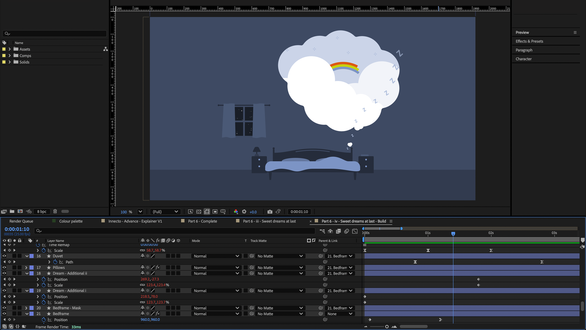
Character & iconographic animation
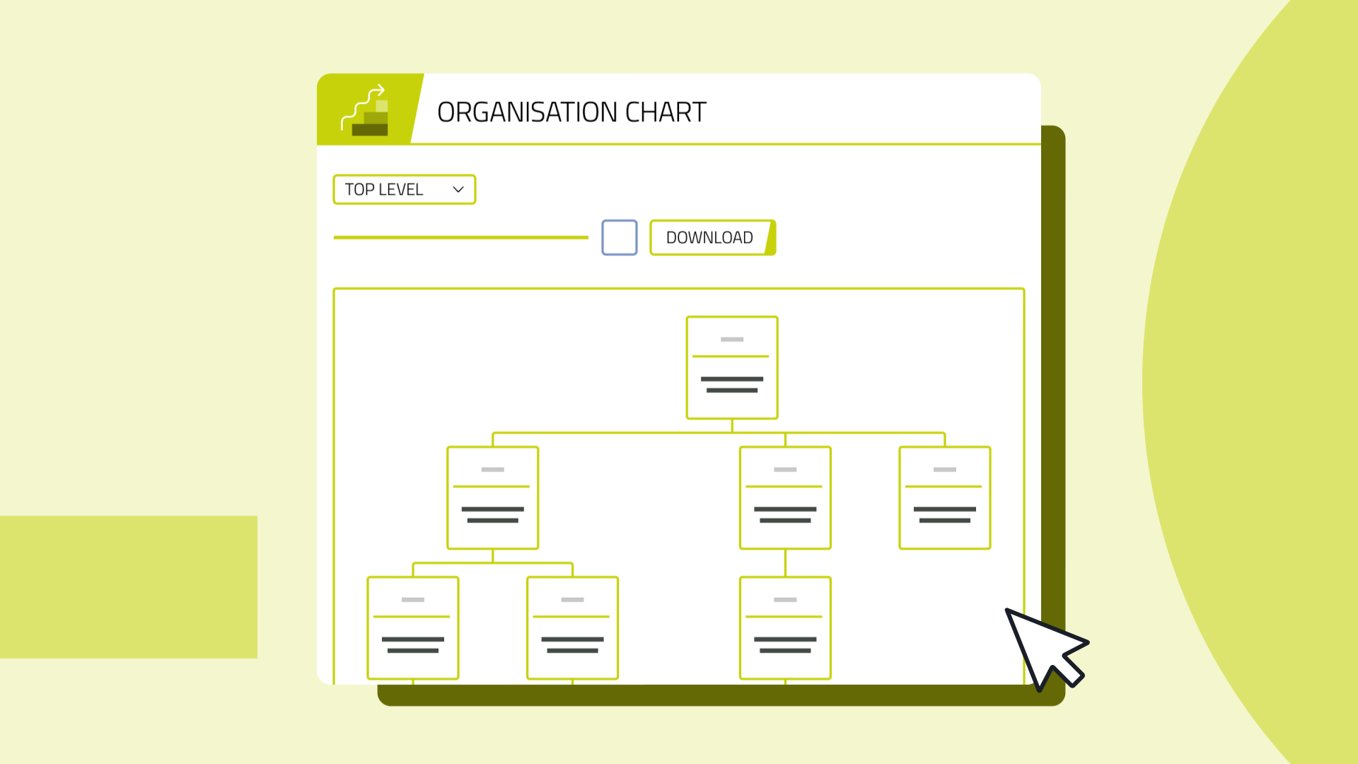
Clean UI screen interpretation
Cohesive branding
Result
Delivered a clear, cohesive suite of sales tools that gave the team a compelling way to demonstrate the platform's value .. And praised by the client as 'fantastic' and 'truly impactful.'